
The Unstoppable Rise of Organic Dials
In the dynamic world of horology, trends emerge, evolve, and sometimes, as a recent observation from Worn & Wound suggests, reach a point of overwhelming saturation. The focus of this particular market development is the proliferation of stone and mother-of-pearl dials, a phenomenon that has, according to Worn & Wound's Zach Kazan, transformed from a distinctive niche into a ubiquitous option across virtually every price point. This shift marks a significant moment in watch culture, prompting a re-evaluation of what makes a watch truly unique in an increasingly homogenized landscape.
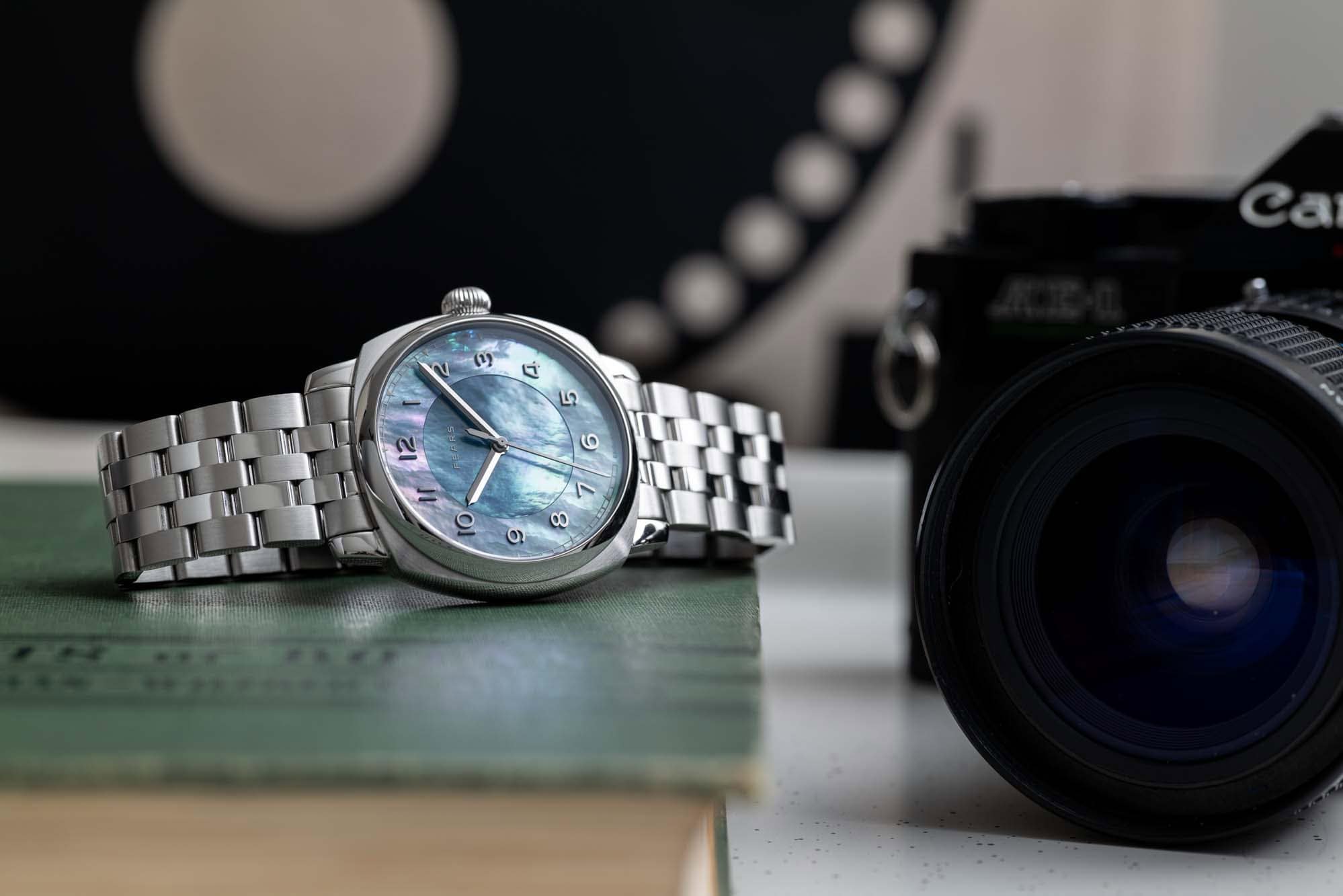
The journey to this current state, as detailed by Worn & Wound, can be traced back to approximately October 2023. It was around this time, during a prominent watch event, that the Fears Brunswick Aurora, with its evocative multi-piece mother-of-pearl dial, captured significant attention. While not the sole catalyst, this particular timepiece is cited by Worn & Wound as a pivotal moment, signaling a shift where organic materials began to appear in unexpected and compelling ways. The initial allure of these dials was undeniable, offering textures, colors, and depths that traditional metallic or enamel dials simply could not replicate. They introduced an element of natural artistry, making each watch subtly unique due to the inherent variations in the stone or shell.
From Niche to Norm: The Commoditization of Stone
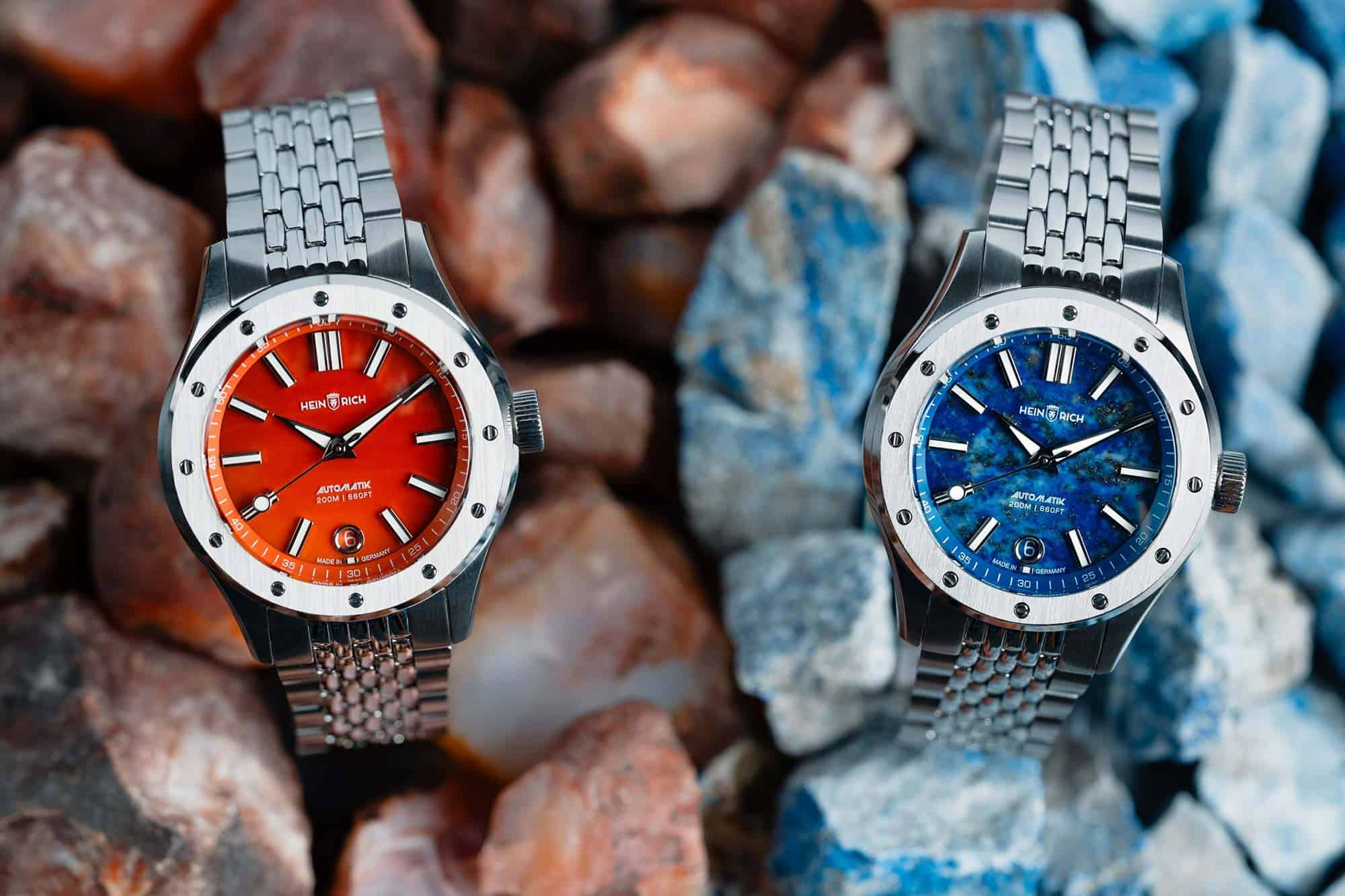
What began as an intriguing design choice has, in a relatively short period, morphed into a widespread trend. Worn & Wound observes that since late 2023, the market has witnessed a "deluge" of watches featuring mother-of-pearl and various stone dials, including lapis, tiger's eye, and onyx. This rapid expansion has led to a market saturation that, in Kazan's professional experience, is "unlike any trend" he has previously witnessed. The once-novelty of a stone dial has become a standard variant, sitting alongside black, blue, and green options in brand catalogs.
This widespread adoption is, in part, attributed to the accessibility of these materials. According to Worn & Wound, the stones used for watchmaking are "quite plentiful," and brands can source them "pretty cheaply" from lookbooks. This ease of access has lowered the barrier to entry, allowing both established giants and smaller independent brands to incorporate stone dials into their collections. Consequently, few brands, as noted by Worn & Wound, have been able to resist the temptation to offer a stone dial option as a new release strategy in recent years. While many of these watches are aesthetically pleasing, their collective influx has, ironically, diminished the very niche they once occupied. Stone dials are no longer a niche; they are a commodity.
The Critique of Saturation and the Call for Creativity
The sheer volume of stone dial releases has, according to Worn & Wound's analysis, led to a sense of fatigue among enthusiasts, even those who initially appreciated the aesthetic. The concern raised is that many brands are now simply "slapping stone dials into watches as an afterthought," or as a cynical attempt to capitalize on a trend. This approach, Worn & Wound argues, represents a "broad laziness" across a significant spectrum of the industry. Rather than investing in original design or innovative material integration, some brands are perceived as "sub-leasing creativity to mother nature" by merely selecting a readily available material and relying on market trends and social media algorithms to drive sales.
This commoditization risks diluting the inherent appeal of stone dials. When every brand offers a similar aesthetic, the distinctiveness that once made these watches special begins to fade. The argument posits that while consumer choice is generally a positive outcome, the current situation has led to a homogenization of taste, where the pursuit of trends overshadows genuine innovation and brand identity.
Navigating the Trend: Examples of Authenticity and Pivot
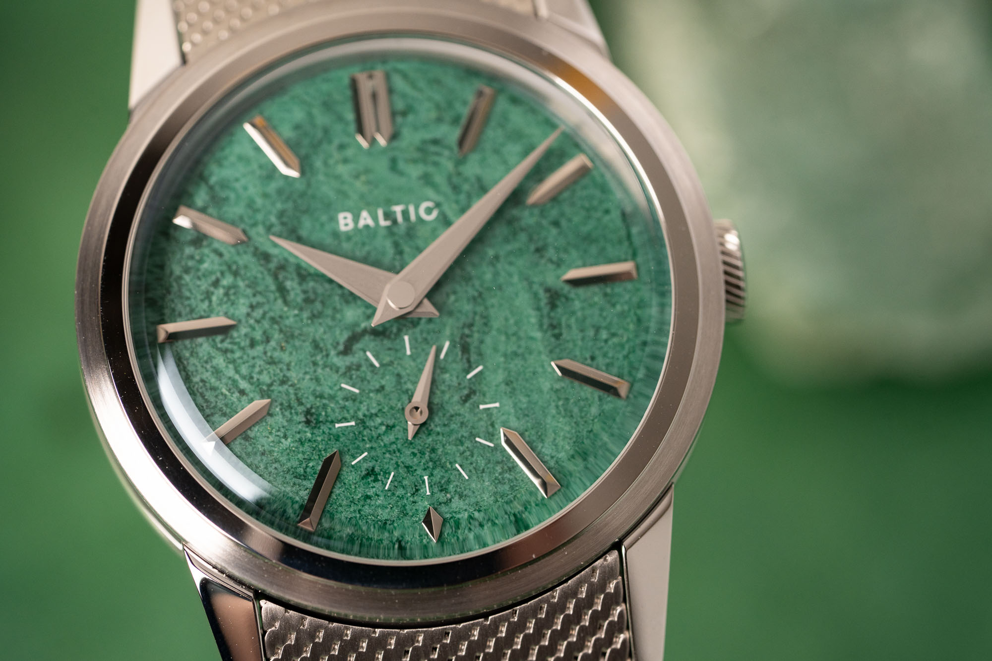
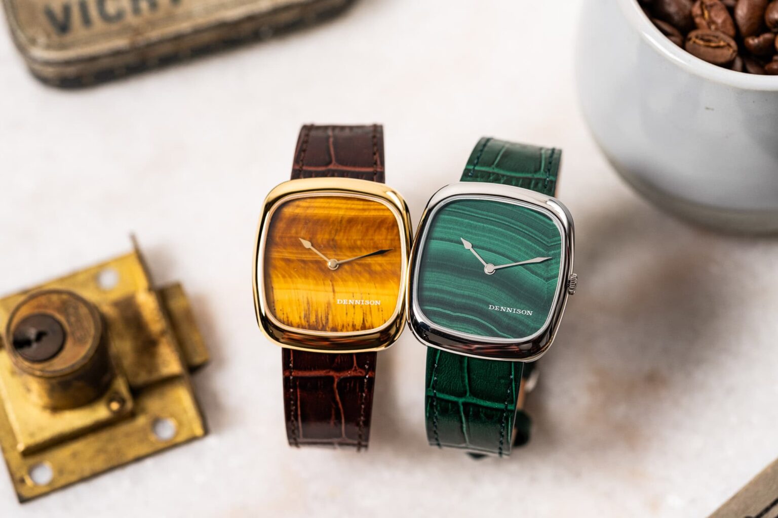
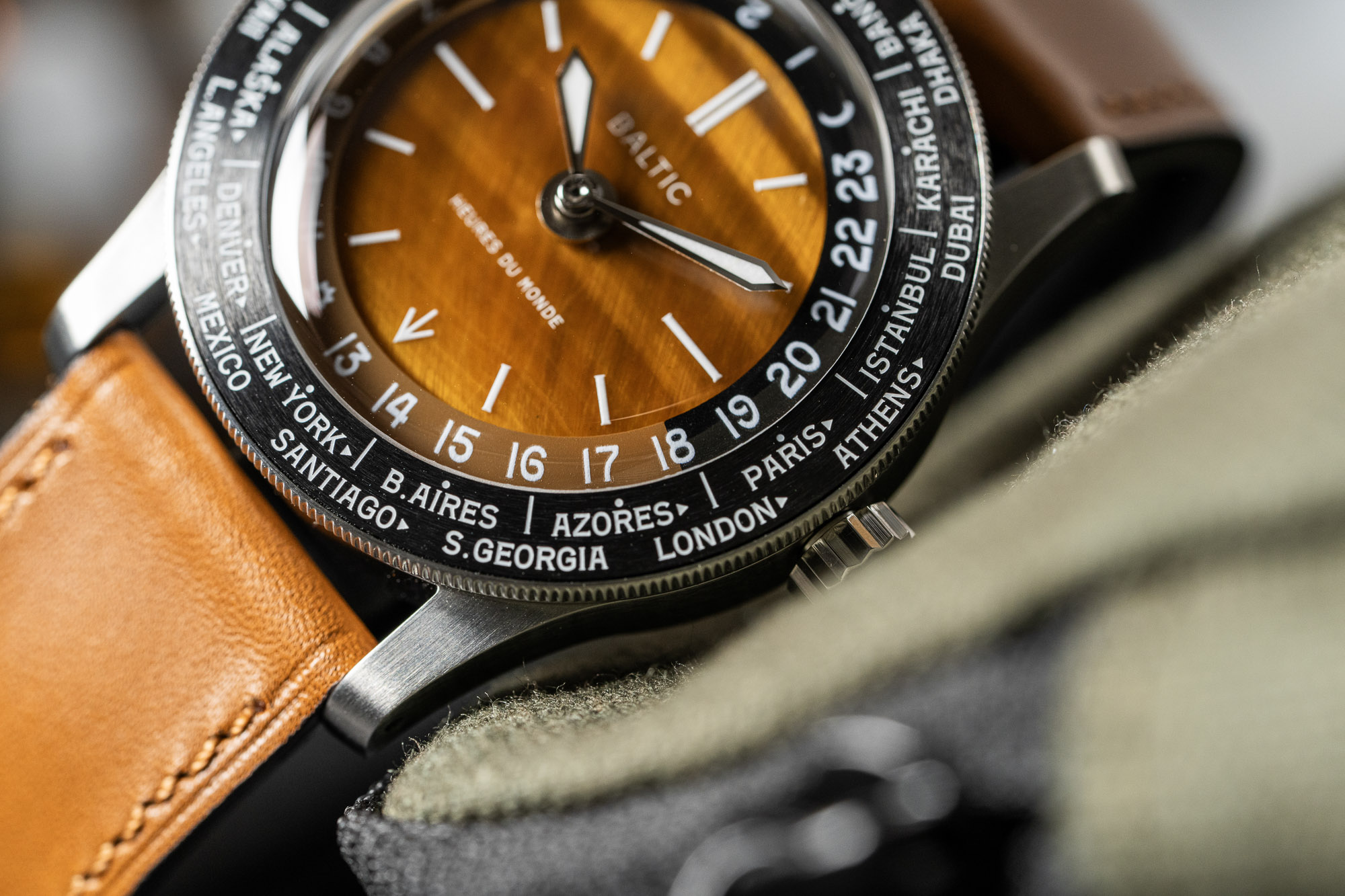
Despite the pervasive saturation, Worn & Wound acknowledges that some brands approach stone dials with a commendable degree of restraint and authenticity. Dennison, for instance, is highlighted for its aesthetic, which is deeply rooted in the 1970s—a period when stone dials experienced their first peak of popularity. This historical connection allows Dennison to integrate organic dials in a way that feels natural and consistent with its brand identity. Similarly, Baltic is praised for its integration of stone dials, particularly within its Prismic collection, where the material complements its vintage-inspired aesthetic rather than feeling like an add-on.
Perhaps even more instructive is the case of Toledano & Chan. This brand, which could have easily become synonymous with stone dials, made a conscious decision to adjust its course. According to Worn & Wound, Phil Toledano explained that their b/1.3r, released earlier in 2026, was initially conceived with a stone dial. However, after observing the commoditization of stone dials among smaller brands, they opted to create something entirely new, questioning the creativity in simply selecting a material from a catalog. This pivot underscores a growing sentiment within the industry: true innovation lies in original design and thoughtful execution, not merely in adopting popular materials.
Beyond the Stone: The Search for Antidotes to Sameness
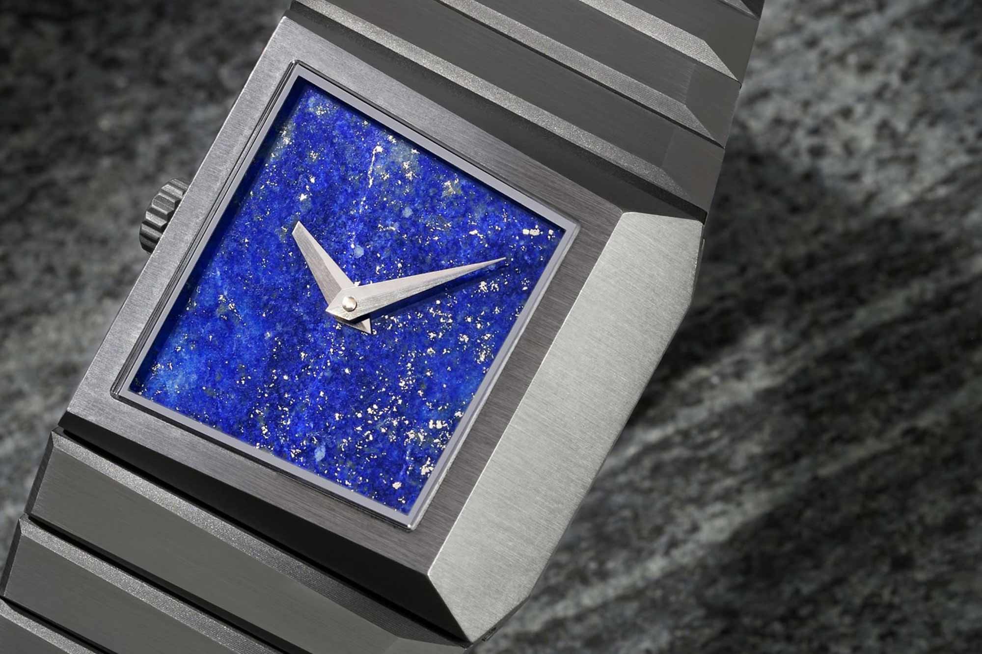
The discussion around stone dial saturation extends to a broader conversation about the state of the watch industry. Worn & Wound references an observation from Stephen Pulvirent’s newsletter, “The Enthusiasts,” co-written with Justin Hast, which provocatively suggested that “More brands should be like Hublot.” This sentiment, while perhaps surprising to some, is framed by Pulvirent as a call for an antidote to the prevailing "sameness" in the market. He argues that in an atmosphere where many brands chase trends, battle for the same customer base, and homogenize taste, Hublot stands out for its distinct, often polarizing, approach.
The current stone dial trend, according to Worn & Wound, represents this very "spectre of the stone dial"—a symbol of market homogeneity. The implication is clear: while stone dials can be beautiful, their overuse highlights a broader challenge for the industry to foster genuine creativity and differentiation. As the market continues to evolve, the demand for brands to move beyond mere trend-following and embrace unique visions will likely intensify, pushing for the next wave of innovation that truly captivates and distinguishes.
Written by Man of the Hour.